for my first page for Art Journal Journey’s (AJJ) September “Less is More“ challenge here I mentioned how using less instead of more is a BIG challenge for me…
I do my best creating when I am not thinking too much or following too many guidelines but I do enjoy a good challenge…
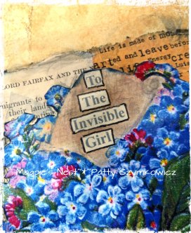
the words are from a Love poem from inside a chocolate wrapper and the Forget-me-not image is one I have wanted to use for some time now from The Graphics Fairy…
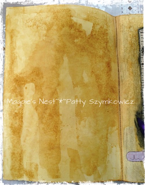
a bit of pencil scribbling on the tea stained background with a piece of cigar box paper for a border at the bottom…
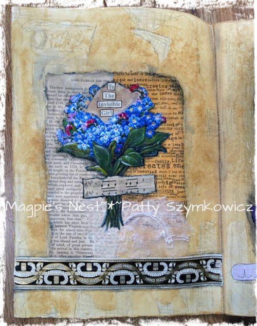
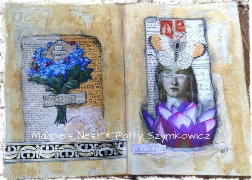 my two page spread completed now I think…
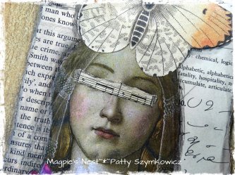
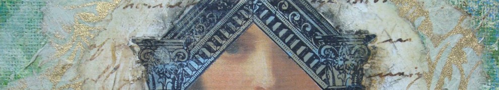
I had to add one last thing to the lotus girl (I know I covered up those beautiful eyes!)…
thank you Art Journal Journey for another great challenge…


Beautiful!!! xxx
LikeLike
These are such gorgeous pages and they look so well together.
I love reading how you make your art – a love poem inside a chocolate wrapper! cigar box paper! -very clever.
LikeLike
I like the covered up eyes, it adds something somehow:)
LikeLike
gorgeous patty…:)
LikeLike
Fantastic Patty! I love all of your details here against your tea-stained background. The forget-me-nots are beautiful, with this, and the lovely message that symbolizes, to me, the covering of the Lotus’ girl’s eyes. So creative and beautifully artistic. xxoo Marilyn
LikeLike
Awesome combined pages, they fits perfect together and all detals too. Love the brilliant blue and lilac colors.
Dear Patty, have a nice weekend. It will be our last sunny summer weekend here in Germany.
Bug hugs Anja
LikeLike
So much beautiful and interesting things so see at your pages!!! love the cigarpaper and the doodeling over her hair ♥ Conny
http://piaromsartjournaling.blogspot.de
LikeLike
Absolutely gorgeous!! You have such a way with layers and space. Nice to meet you! Thanks for visiting, ~kathy
LikeLike
I love the use of blue..it makes so vivid and rich.
LikeLike
Love what you did with this page. And covering the girls eyes worked perfectly with the words you used. I think you nailed the challenge.
LikeLike
Oh my goodness! You really rose to the challenge, dear Patty!! I enjoyed going back to your link on removing labels on cigar boxes. Thank you!!’ Your layout is so lovely and certainly shows that “less is more!” xoxo
LikeLike
They are beautiful. I like her eyes covered as well! Exquisite!
LikeLike
Gorgeous pages Patty!!! Love the forget-me-not flowers. The blues really pop against the background!!! ~Sophia
LikeLike
oh these are gorgeous Patty!!!
LikeLike
I think you are stepping up to the challenge well. Lovely pages.
LikeLike
I love your gorgeous pages, dear Patty. less is more is not easy.
Wishing you a lovely weekend
LikeLike
This looks breathtaking Patty! I am fascinated by all your remarkable techniques! AMAZING! a wonderful spread now in all and also individually!
Have a wonderful sunday and thank you so much for your encouragement of Art Journal Journey Challenge!
xxx Susi
LikeLike
A fantastic and creative page again! Wow!
LikeLike
Patty, this is absolutely gorgeous!!!!!!!!!!!!!!!!!! I love it!!!!!! 🙂
LikeLike
A beautiful combination, Patty. It works very well together and of course I love the blues. Lovely.
LikeLike
Less is always more when you’re around. Can’t say this enough. You put the C in collage. Adding the sheet music over her eyes was a great way to tie the two pages together, too.
LikeLike
oh i love this so much!! the covered eyes are perfect for this. and i agree, less is more difficult than more!
LikeLike
Gorgeous, and beautiful pages, ,they are a little story told, together, and I love your “invisible” girl and her blue,blue bouquet ,resting on the wonderful old papers.. So beautiful, is the pages with the stained from tea, tones,- and the bluish colours ,- and so great with your reused materials, dear Patty!
Hugs and sunday kiss- from Dorthe
LikeLike
The tea stained background is yummy as is the colour palette as a whole, the way you inject colour but it has a timeworn quality to it, gorgeous.
As for covering up the girl’s eyes, the perfect decision.
Memorable artwork.
Wishes
Lynne
LikeLike
Beautiful completed but even the simple painted page in the first picture resonates with me!
LikeLike
Hey Patty, love the background, then the page half white have soft brown, lovey with the lovely flowers, and covering her eyes makes the pages join together, beautiful work, thanks for sharing these lovely pages..
LikeLike
Another masterpiece!
LikeLike
So pretty. And covering her eyes really made her into the invisible girl. 🙂
LikeLike
Patty, you are fabolous. It seems “Less is More” is a new fave of you.
Have a beautiful day. Hugs Birgit
LikeLike