this week’s challenge at Wednesday Stamper/Mittwochstempler is anything to do with Tim Holtz … his style … stamps or other products … of which there are many 
forgot to photograph my favorite starburst stamp by Judikins too
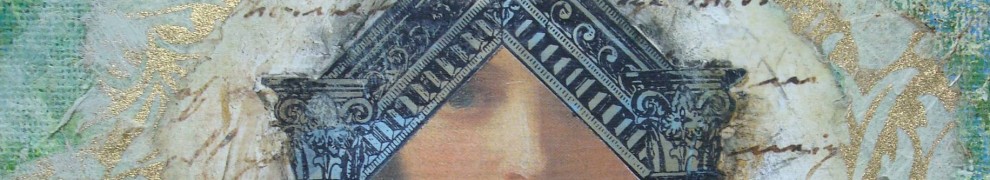
I used several rubber stamps from the Tim Holtz Stamper’s Anonymous line
 a double click of my postcard will show you the texture in my painted and stamped background
collaged scrap papers on watercolor postcard … paints … a Dover horse image … stamping with ink and white paint
“The doors we open and close each day decide the lives we live” ~Flora Whittemore


Wow, what texture. You are right about getting the full effect when you double click. This is an amazing card, and as usual, I appreciate how you put so many disparate bits together and make them work. Love this piece of art!
LikeLike
Patty; love what you did with the Tim Holtz challenge! He provides the materials but it’s your creativity and talent that made this card a success! Awesome! xxoo
LikeLike
the grunge looks great!!! and of course a great TH-playing. 🙂
hughs
katrin
LikeLike
it’s beautiful: I love horses very much . I think it’s a marvelous animal and you do a splendid creation with them
excuse my english I don’t speak english very well
🙂
LikeLike
Love the horses!!!
LikeLike
I had just posted about an upcoming workshop I’m teaching and noticed that the theme for Wednesday Stamper was Tim Holtz today! I didn’t realize I was playing today, but I guess I AM. LOL
LikeLike
Patty – you did good ole Tim right! I agree with Elizabeth – everyone needs to click on your creation to get the full amazing quality of this work. I do love the use of the paint, the stamps, and of course the Dover image of the Horses! Well done…. *bravo* *bravo* *bravo* : )
LikeLike
this is an awesome piece Patty!! and hey, you have the blogspot guru (LOL!) at your disposal, let me know if I can help!xoxo
LikeLike
Great design and movement Patty! I love the use of the stamps…it’s just perfect!
LikeLike
Love the horses of course, but also love the use of both the ink and white paint. Nice!
LikeLike
The grunge stamps are amazing! I do hope that your visitors enlarge your postcard to see all of the yummy texture and detail – it’s beautiful! Hugs, Terri xoxo
LikeLike
I had to go and enter this one Patty You know I have lots of TH stuff lol I love this post card
Love Dawn xx
LikeLike
Tim is one of my favorite go to guys when I get stuck or need to play a little more with my “stuff”. Have a great time making your wonderful marks. Imagine and Live in Peace, Mary Helen Fernandez Stewart
LikeLike
Ooo-la-la! When I enlarged and it filled my monster-size computer screen what a sight! Gorgeous texture and the interaction of the black and white against this shade of blue was great. I kept thinking how gorgeous it would be if you could somehow transfer this whole piece to a t-shirt you could wear! FUN!
LikeLike
Love this one, Patty! Fab grungy circles!
LikeLike
Beautifull grunge fab piece! Youre background is beautifull!
LikeLike
The circle stamp is a gorgeous-one – and your card,too.
LikeLike
Very strong design, love the colour
LikeLike
this is beyond everything!! LOVE the blue, LOVE the stamps and LOVE the muybridge horse strip!! applause!!
LikeLike
Oh wow Patty your T!m Creation rock.
Love this grungy look.
LikeLike
mmmm love the texture,,,the blue and the horses!
LikeLike
Wow…great job you did with Tim Holtz theme…!
LG Anke
LikeLike
That’s a super stamp! I can see why it’s a favorite!
LikeLike
beautiful, beautiful, beautiful! great stamping!
LikeLike
I hate to be a critic, but is it RAINING in VA? Your card is wonderful, but I am a little confused by the caption. 🙂 The card is kinda dark. I am sure you haev a rationael. (sp?) heehee
LikeLike
This is such an amazing design. I absolutely love the darker side of it especially the way you used the horses. The stamped images fit so perfectly. I only ever used Tim Holtz stamps yesterday for the first time and I am impressed how superb they are.
LikeLike
Such a fantastic take on this theme. Great piece of art.
LikeLike
I love your style! I’m yet to see something you’ve done that I haven’t liked!
Keep it up 😉
Hugs, Ashlyn
LikeLike
like all the colours and layers
LikeLike
Love this!
LikeLike
Grunge looks great!
I noticed the horse pic is a little pixelated. Did you print by yourself? Most pictures downloaded from the web are 72dpi, and it’s best to change it to 150dpi to print.
If you have no idea what I’m talking about, I’ll look up a tutorial 🙂
LikeLike
Very creative–the postcard is appealing.
LikeLike
Love Tim’s stuff, he is so creative. Nice work with the stamps.
LikeLike
Love the design! Great piece!
Hugs Hanne
LikeLike
Oh wow Patty, that’s sooo creative!! love the texture and how you’ve used the stamps!! Brilliant artwork!!
Hugs,
Linda
LikeLike
How gorgeous is this. Its just so wonderful, I love it Patty.
LikeLike
stunning background wow love it
chriss x
LikeLike
Cool!
LikeLike